One way to achieve customer service consistency is to create a knowledge base as a single, infallible point of knowledge for customers or even for your staff.
Building a knowledge base isn’t easy, but luckily there are examples all around the internet that you can take inspiration from. Read on to see how other companies are doing it, and what you can learn from them.
Example 1: Walmart — Make Your Main Categories and Search Bar Front and Center
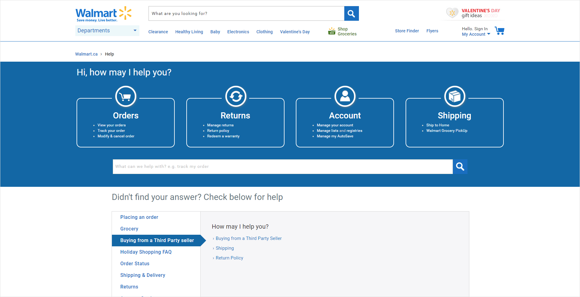
The world’s biggest retailer doesn’t just employ greeters at the door. They’ve designed a very clean and easy to use knowledge base that provides customers with the information they most often ask for right from the start.
Notice how the eye is first drawn to four simple categories at the top of the page. Each of the categories is simply worded and easy to understand. Customers can click through to find more detailed information, or they may even find the answers they need in the FAQs under each heading.
With an integrated search bar clearly accessible in the middle of the page, and additional menus at the foot of the page to drill down for more information, it’s clean and simple.
Knowledge Base Best Practice: Make your main categories and search bar front and center.
Example 2: Evernote — Keep Your Categories and Design Simple and Easy to Understand
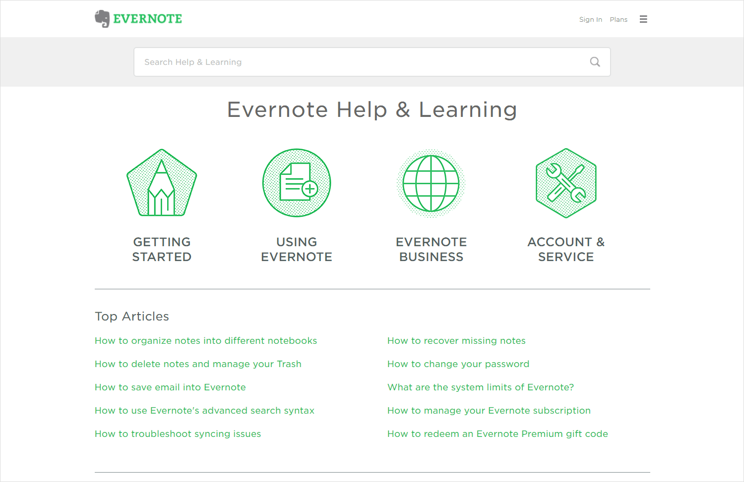
Another really simple knowledge base that maximizes the use of a search bar is Evernote. This note-taking app has gradually become a core tool in my day to day life and I’ve been very pleased with the clean and simple features in its knowledge section. Finding out information whenever I was stuck and learning more about what the product could do was simple and easy and wasted no time at all.
Like Walmart, Evernote have also chosen to go with a four-section categorization at the top of the page. Most queries will fall into one of these categories, and by providing these headings as a way to access further information, Evernote have made their knowledge base very simple to use.
Knowledge Base Best Practice: Keep your categories, and your design, simple and easy to understand.
Example 3: Eventbrite — Consider Splitting Your Categories by Customer Type
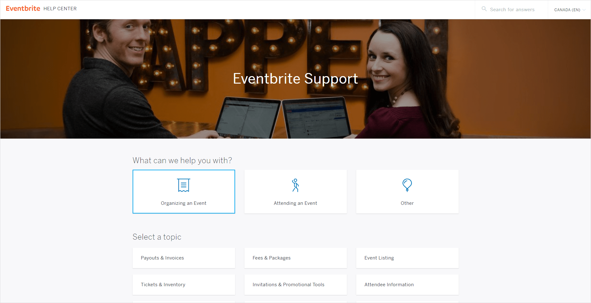
Eventbrite is another company that has got its customer knowledge base under control. Eventbrite is an event management and promotion website that allows visitors to find live events near them, as well as allowing event organizers to create an event with Eventbrite and use their online ticketing instruments to collect revenue.
There two user groups will have distinct and separate questions, and mixing them together into one knowledge base would be confusing. Instead, Eventbrite have implemented a question to allow their customers to only view the knowledge base articles that are relevant to their needs. This is a great tactic for organizations with different user groups.
The page is also well designed with vibrant colors which are consistent with the brand’s colors. All in all, simplified choices right at the beginning help drive the right customers to the right articles, increasing usability and minimizing confusion.
Knowledge Base Best Practice: Consider splitting your categories by customer type.
Example 4: U.S. Bank — Consider Splitting Your Categories by Product
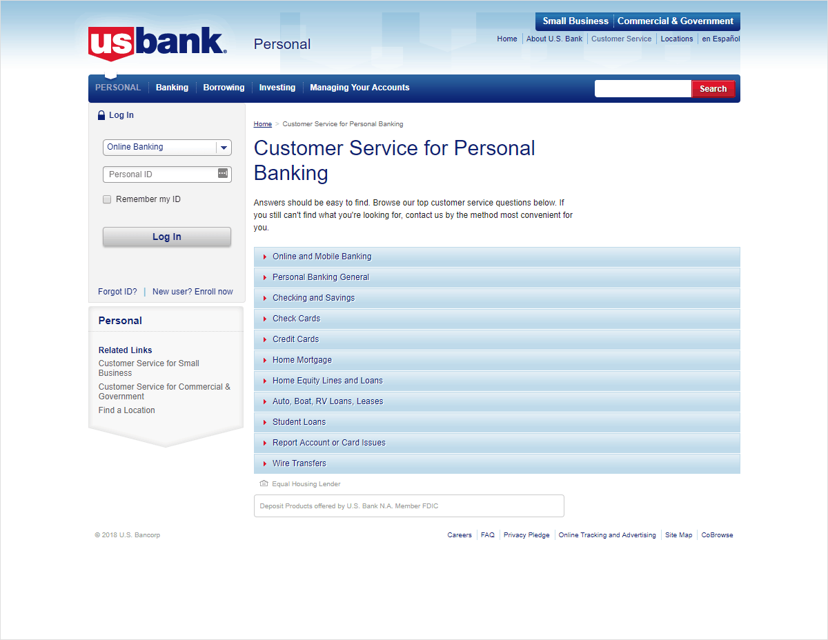
Banks have also come up with simple yet effective ways of offering self-service to customers. One such bank is U.S. Bank, which uses self-service solutions to simplify banking for their customers and to avoid long queues. The front page of their Customer Service Portal prominently lists top customer questions and provides easy access to the articles that can help.
Instead of making the entrance to their knowledge base filtered by customer, U.S. Bank have decided to filter by product. This is a good tactic — the alternative here would be to have a single knowledge base for each question, and a series of product-specific variations within the same article. This could be confusing for customers who only need to access information relating to their product.
Once again, search is simple to find — although perhaps not as prominent as other sites, who place a search box in the main content of the page. The theme throughout the site is crisp, clear and informative.
Knowledge Base Best Practice: Consider splitting your categories by product.
Example 5: Lyft — Consider Which Questions Are Worthy of Your Main KB Page Entrance
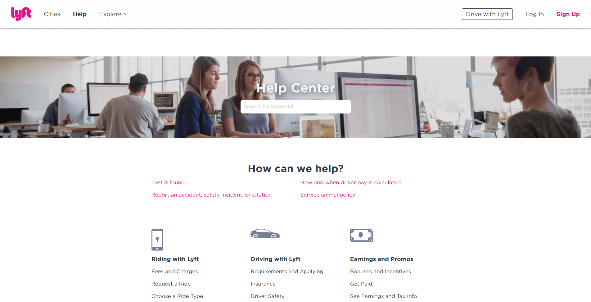
Lyft is another ride sharing company that is quickly picking up steam in markets around the world. Their Help Center is easy to use and nicely presented.
Lyft have also implemented a menu that filters by customer, with different categories for riders and drivers — although the ‘Earnings and Promos’ menu seems to cover both audiences.
Lyft have also implemented four frequently asked questions at the top of the page. This can be a good tactic, but remember that ideally you should only be presenting information to the customer that’s relevant to them. It could be more appropriate to sort these questions under customer-specific menus, to avoid any potential confusion from customers.
Knowledge Base Best Practice: Consider whether questions relating to specific customer scenarios would be better placed under category menus, or whether they are widely asked enough that they warrant a place on your main KB page entrance.
Example 6: Exacq — Use a UI Design That Your Customer Base Will Already Be Familiar With
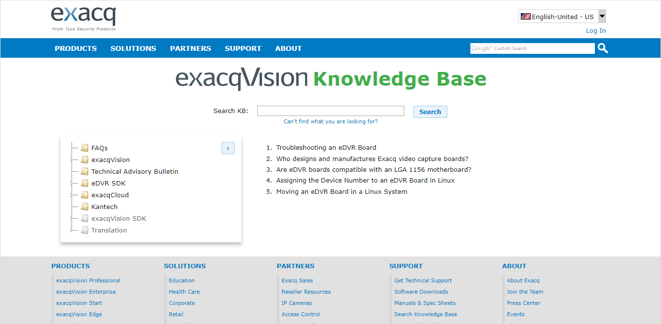
More of a technical knowledge base than many of the others, Exacq Technologies offers a knowledge base to help installers struggling with their equipment.
What makes this knowledge base really appealing is that the look, feel and structure is built to replicate the look and feel of a computer folder structure. In this way, Exacq have created a knowledge base that feels familiar to its audience, which will enhance its ease of use.
Knowledge Base Best Practice: Use a UI design that your customer base will already be familiar with.
Use Cases
More and more companies are recognizing the role that knowledge bases play in providing a different type of service to their customers — one that’s available 24/7, on demand, and doesn’t require customers to go to the effort of contacting a customer service agent.
A good example of a customer service use case is the Australian government’s self-service portal. Under the Department of Human Services, for example, people can sign up for Medicare, Child Support and inquire about changes in the availability of services.
The Australian government benefits from this self-service channel because it puts less strain on customer care agents and office workers. These self-service instruments are also good for collecting engagement data to spot trends and plan for future service provision.
Another use case for customer self-service is the patient portal by UAB Medicine. It is a free to use portal where patients can have their medical questions answered. A number of doctors contribute answers, and visitors can easily find solutions.
Apart from this, the portal has a personalized page for patients to access parts of their electronic medical records. A directory is included which has most of the renowned healthcare providers that are well categorized by location, specialty (dentist, ophthalmologist, etc.) and gender. By selecting the center that you already go to for healthcare, the portal gives you personalized suggestions. This is bolstered by the FAQ section for easy accessibility to information.
Best Practices, Whatever Your Use Case
As you can see, there is no hard and fast rule when it comes to knowledge bases. The guidelines though are all the same:
- Make it easy to use and easy to find information
- Sort information into relevant categories
- Try to present the user with frequently asked questions
- Provide a search tool in case they are looking for something else
- Use UI elements your customers will be familiar with
- Focus on helping – stay away from jargon – as the goal is to NOT have them need to call or chat with you!
Once you’ve implemented a knowledge base in your organization, you’re going to see some huge benefits. Let us know how you get on in the comments!
Download now: How to Create Perfect Knowledge Base
Creating a knowledge base for your business is a win-win customer service strategy. This eBook shares best practices in the planning, structuring and creation of knowledge bases, based on our experience in helping our customers set up and optimize their knowledge bases.
Download Now
eBook


