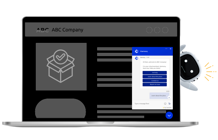
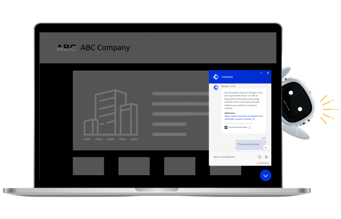
Live chat is an invaluable tool that can help you provide customers with real-time support. Clicking the chat button is the first touchpoint a customer has with your live chat solution. You may think that all chat buttons are the same, however research shows that 75% of judgements about your website’s credibility are based on overall aesthetics. This proves that the design of your website is crucial to how your brand is perceived by customers, and your live chat interface is no exception.
Keeping it Consistent

Good design principles apply to your chat button as much as they do to your website. Your chat button should match your website branding in order to create a cohesive and consistent user experience for the customer. It should be simple and easy to access, but visible enough to stand out. By leveraging Comm100’s chat solution, you can fully customize your live chat button via:
1. Button Types
There are 3 different types of buttons available:
- Adaptive buttons are icons that include interactive animations to grab your customer’s attention, and are fully optimized for web, tablet, and mobile browsers
- Image buttons use photos from either our gallery, or of your own choosing
- A text link is the simplest “button” and contains only a text call-to-action
2. Color and Size
The color and size of your button should match your website’s branding. Ensure you choose colors that align with your brand’s colour palette, but don’t blend directly into your website. If you are using an image button, the size of your chat button should be relative to its position on the website. Too small and your customers might miss it, while making it too big might irritate customers and detract from the user experience of your site.

3. Location, Location, Location
Your chat button should be easy to locate on your site. The most common placement is on the bottom right corner of a webpage, but any location with white space, or near the top or side generally make it easiest for customers to locate.
Read more: Best Practices for Adding Live Chat to Your Website
4. Responsive Mobile Experience
85% of adults think that a company’s mobile website should be as good or better than their desktop website. Adaptive chat buttons adjust to the size of the screen automatically, while Image chat buttons are customizable. Your mobile live chat button should be consistent with your mobile website so customers are able to easily access mobile chat support without interfering with their small-screen experience.
Best practice tip: For the most consistent experience, we recommend using Adaptive buttons.
As one of the most important, but often overlooked features of live chat, a well-designed chat button can go a long way towards providing good customer support. Not only can it make or break a customer’s user experience, it also helps you attract and engage with customers.
AI-Powered Live Chat That Empowers Agents and Impresses Customers
Enhance every customer interaction with the most advanced, AI-driven live chat solution on the market.
Learn more
Solution


