Let’s say that live chat is a journey. You are a customer who is trying to get from Point A, an issue or inquiry, to Point B, a resolution or answer. You’ve pushed the live chat button—now through what means will you arrive at your destination?
The live chat window is the vehicle that transports customers or website visitors to the answer or resolution that they seek. In other words, it the platform that will ultimately carry them to their final destination: satisfaction. Without a chat window, there would be no live chat. This makes it a vital part of the live chat experience.
Although we may think of the live chat window as the space where we actively message a company’s online agent, the live chat window is in fact much more than that. A live chat window is any window through which your website visitors can interact or communicate with your company. The windows where visitors can fill out a pre-chat form, leave an offline message, and rate your company’s live chat service are all also live chat windows.
In this blog post, we will take you through some tips and best practices for customizing your own live chat window. By following these tips and best practices, you can make sure that your live chat window—like any good customer service vehicle—is professional, attractive, and functional.
AI-Powered Live Chat That Empowers Agents and Impresses Customers
Enhance every customer interaction with the most advanced, AI-driven live chat solution on the market.
Learn more
Solution
Color Your Live Chat Window to Match or Complement Your Brand
Choosing the right color for your live chat window is important to the impression that it makes on your website visitors. But why is color so important?
The importance of color in design stems from the significance of color to the human mind. Color is used every day to create ideas, express messages, spark interests, and generate a variety of emotions.
Choosing colors for your live chat window is not about just choosing your favorite colors. Just like when designing your website, the colors chosen for your chat window should coincide with and strengthen your brand’s image. Use the wrong combination of colors and your live chat window may look unprofessional at best, or like an untrustworthy junk advertisement window at worst.
Here are some of the color schemes we recommend that you consider when designing your live chat window:
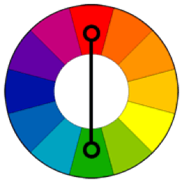
- Complementary colors:These are colors opposite one another on the color wheel. The contrast of complementary colors creates a vibrant look. Designing a live chat window whose colors are complementary to your website or brand’s colors is a great way to draw attention to the window.

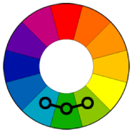
- Analogous colors:This color scheme involves colors that are next to each other on the color wheel. This usually creates serene and comfortable designs.

- Monochromatic:Colors that work well individually may not be as pleasing together as they are by themselves. By using one color, or the combination of one color and neutral colors like black or white, you can create a professional, clean look.

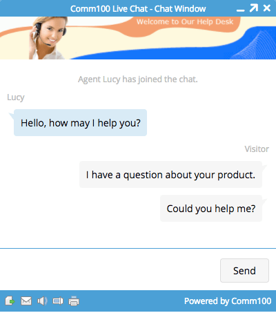
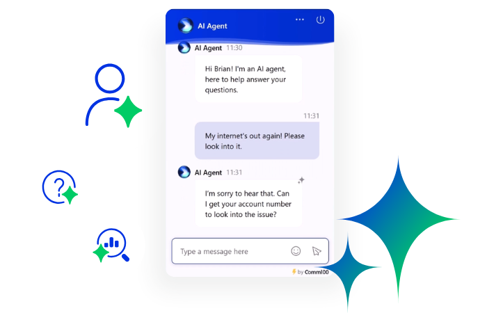
To see how color impacts a live chat window, check out for example the example below:
For this live chat window, blue is the main color that is being used. In the banner image, the company has included a slight streak of orange, the complement of blue, which gives the chat window a vibrant and appealing aesthetic. This chat window contains its company’s brand colors, which are white and blue, and the orange gives the window an added visual appeal without losing professionalism or brand likeness.
When you go to design your own live chat window, remember:
Do:
- Use colors that make your live chat window a seamless part of your brand’s identity. This means using your brand’s colors, or basing your live chat window colors off of your brand’s colors. This will give your chat window a cohesive, professional feeling, and will let your customer know that they are on the right page.
- Use complementary colors to add visual interest to your chat window and encourage visitor engagement. Make sure the complements are not too strong or visually unpleasant.
- If you would rather give your live chat window a more neutral feel, try using one of your brand’s colors in conjunction with colors such as white, grey, or black.
- Keep the amount of colors used in your live chat window to a minimum in order to avoid confusion or a sense of busyness.
Don’t:
- Use colors that are too loud or hard on the eyes.
- Don’t use a text color that is too bright or too similar to the window color to avoid making your text hard to read. If you make proactive chat requests, this could give your window a spam-like feel, which will lead to less chats being accepted.
Agent Avatar versus Banner Image
There are two common practices for customizing your live chat window: using an agent avatar and company logo, or creating a banner image. But how do you know which to use? Let’s explore each of these two practices now:
Banner Image
Although a banner image is not a necessary part of the live chat window, it is a visual element that can enhance the overall appearance of the chat window. A banner image can consist of a variety of elements, such as the company’s logo, a stock photo of a customer service agent, welcome text, or any other combination of elements that your company seems fit. The banner image is entirely customizable, which makes it an extremely versatile element of the live chat window. This is a great option if you have a designer or a team of designers to create this image for you. It is also great to use a banner image if you want to incorporate your company’s slogan, or other text which cannot be used in conjunction with the agent avatar.
In order to design a successful banner image, we recommend that you try and abide by the practices laid out below:
Do:
- When designing your banner image, be sure to create an image that follows the principles of good design. This means creating an image that has the following:
- Balance – Good distribution of elements such as images, colors, and space.
- Unity – A sense of harmony between all parts.
- Color – Make sure that the color(s) in the banner image relate directly to or go with the colors in the chat window.
- Movement – The banner guides the visitor’s eye upwards, and to focal areas along the image, such as your company’s name or logo design).
Don’t:
- Don’t create a design that is cluttered.
- Don’t design a banner image that has little to do with your brand image.
- Don’t create a banner image that has nothing in common or contrasts too sharply with the rest of the live chat window.
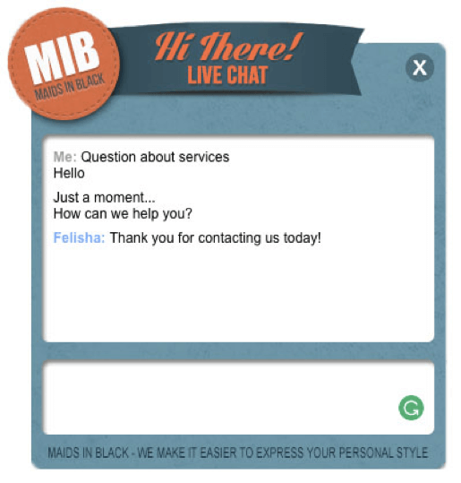
Below is an example of a successful banner image, which is used by the cleaning service company, Maids in Black:
The design for this banner image is simple and clean. The banner’s colors are cohesive with the colors used in the rest of the chat window, and the burnt sienna creates a visual contrast against the dark blue. The text used in the banner functions well as a friendly greeting, while also incorporating the brand’s logo. To top it all off, this banner uses different shapes, which create movement and make this design unique. The visitor’s eyes start out at the circular logo, and move out towards the greeting, or visa-versa.
Agent Avatar
If you don’t want to use a banner image, you can instead opt to upload your company logo and agent avatar to the live chat window.
Using an agent avatar gives your live chat experience a more intimate feel, as your visitor can see who they are talking to. This is great for business that have specialized live chat agents, or who have their customers communicate with a specific account manager.
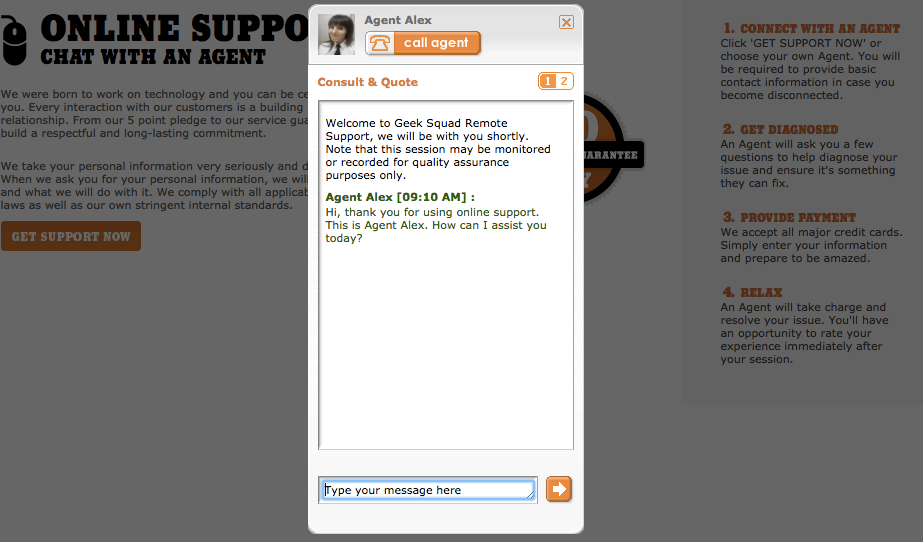
Some companies will opt to either use an agent avatar or their company logo, rather than enabling both options. Take Best Buy’s Geek Squad for example. Website’s visitors have the option of choosing to connect with the next available agent, or they can pick an available agent from a list. Each agent has their own profile, where they list their credentials and give a brief introduction to who they are. Because the Geek Squad is a team of technology experts, their live chat experience aims to humanize their agents, so that visitors feel like their issue is in a real, accountable person’s expert hands. This is done so well that the company doesn’t even need to have the Geek Squad’s logo on their live chat window—the live chat agents’ avatars are representation enough of their brand to do the job.

Nike on the other hand prefers to feature only their logo, rather than giving agents a substantial visual presence. This puts additional visual attention on their logo, which they have customized to be the largest visual element in their live chat window. Talk about driving the point home!
When featuring an agent avatar and your company logo rather than a banner image, take care to do the following:
Do:
- Use agent avatars that are clear, front-facing, and well-lit.
- Make sure that your agents are dressed appropriately in their avatar photo, and that each avatar reflects your company’s professional image
Don’t:
- Don’t use avatars that are dark, pixilated, or that don’t properly show who your agents are. This seems unprofessional, and defeats the purpose of using an agent avatar in the first place.
Make Use of Either the Embedded or Pop-up Chat Window
One good practice when designing your live chat experience is knowing whether to use an embedded or pop-up live chat window.
Pop-up Chat Window
This classic option is basically what it sounds like—when a customer clicks on your live chat button, the live chat window opens as a pop-up window, separate from and in front of the window from which you were navigating.
Many companies, such as Norwegian Airlines, still use this approach. Norwegian’s live chat window opens in the pop-up fashion, and in doing so, takes up the visitor’s whole computer screen. The benefit to this is that it immediately becomes harder for the visitor to accidentally navigate away from the chat window. Another benefit is that the pop-up chat window demands more of the visitor’s attention, making it harder for them to get distracted by another browser tab and forget about the chat window before an agent even answers. Norwegian Airlines even goes the extra mile with this approach, by automatically opening its live chat window in full-screen mode. This type of window is also very popular as far as a proactive chat window, given its attention-grabbing nature.

However, there are two heads to the same coin. The downside of the pop-up chat window is that pop-up chat windows are easily closable. If you are sending proactive chat messages using a pop-up chat window, customers may reflexively close the chat window as it appears over their current webpage. Another downfall is that because the live chat window pops up over the company’s webpage, it can be difficult for customers to reference the page that they were looking at as they chat with agents. This may make it harder for customers to ask questions about a specific product.
Embedded Chat Window
The embedded chat window is a chat window that is built in to one of the extremities of the current webpage. This sort of chat window is commonly set to appear at the bottom right-hand corner of the webpage (you can also make it appear at the bottom left), and thus does not interfere with the visitors’ browsing activities. The embedded chat window is very similar to the set-up of Facebook’s instant messaging platform, and therefore is familiar to many users.
One company that makes use of the embedded chat window is Sprint. Because the chat window appears as a part of the current webpage and not as a separate unit, visitors have the advantage of being able to browse Sprint’s products and plans while they wait for a response from an agent. If they want to reference a specific product or plan that they need help with, that is also easily done with this non-intrusive chat window option. This type of window also works great for proactive chat, since a customer has the option to minimize the window if they aren’t interested right when they receive the message, but they could be later.

The downside to this chatting method is that if a customer accidentally navigates away from the webpage mid-chat, the chat session will expire. This chat window’s more subdued nature also means that visitors who have initiated a chat might navigate to another webpage on a separate tab while waiting for an agent’s response, and forget about the chat session all together (note that this scenario is not fully preventable with the pop-up chat window either).
When choosing between an embedded and pop-up live chat window, we recommend the following best practices:
Do:
- Consider your company’s live chat goals and the purpose of your live chat when deciding which chat window style to implement. Is your visitor going to have to reference something important on the page that a pop-up live chat window might block? Or is it vital to try and interrupt the viewer’s other activities?
Don’t:
- Don’t go overboard with a pop-up chat window, especially if you are using it for proactive messaging—don’t fall into the trap of having it function and look like an annoying pop-up ad.
Customize Live Chat Window Style on Mobile Devices
Nowadays, we have access to nearly everything on our mobile devices. When given the option, many of us opt to resolve customer issues online on the go with our mobile devices, rather than waiting to get home to our computers. This is why having a live chat window that is optimized for mobile devices is so important.
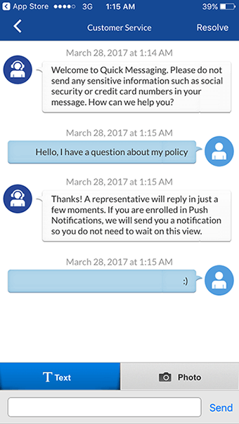
One company that has done a great job of optimizing their mobile live chat window is Geico. Geico’s mobile chat window is designed to take up the whole mobile screen, optimizing visibility of the text. The window has a simple, minimalistic design, which also makes clear communication easy on smaller, hand-held devices. This chat window is so user friendly that it is even integrated with push notifications, so that the customer receives a notification whenever the live chat representative has responded to a message.
Comm100’s live chat widow is automatically optimized for mobile platforms. However, you can use CSS customization to further customize your chat window style on mobile devices.
Do:
- Use CSS mobile window customization options if you want to do the following to your mobile chat window:
- Change the color of agents’ messages
- Change the size of the company logo
- Change the color of the send button and other various buttons
- Change the color of the window title
- Change the border color of the text or drop-down list fields in the pre-chat or post-chat surveys (if you have these elements enabled)Balance – Good distribution of elements such as images, colors, and space.
Don’t:
- If you do decide to use CSS customization, don’t forget to supervise it closely to eliminate any bugs or inconsistencies. CSS design is to make your live chat window even more of what you want it to be, so that’s what it should do!
Set and Enable Sound Alerts to Keep Customers Focused
Some visitors may engage in a chat, and then switch to another window or tab while they wait for your response. Enabling sound alerts can be a great way to notify visitors of when an agent has responded to them.
Here are some best practices for enabling sound alerts:
Do:
- If you choose to enable sound alerts, take care to select a sound that will serve as a gentle reminder that the visitor is still in the conversation. This means selecting a neutral, short tone.
Don’t:
- Don’t use any sounds that may be annoying, jarring, or inappropriate. You don’t want to provoke your customers, or for them to have to mute their computer to continue chatting with you.
Conclusion
Customizing your live chat window is an art, not a science. So, don’t forget to have fun while doing so! By creating a live chat window that is professional, functional, and cohesive with your website, you will have designed the optimal communication platform; the vehicle for fulfilling your visitors’ needs.
Setting up Live Chat: Customer Experience Matters for Live Chat and Telephone Teams
We have written this eBook as a guideline on how to best set up your live chat in a way that fits your desired customer experience. Its contents are ideal for managers and developers who are looking to design a live chat that is both attractive and functional.
Download Now
eBook


